Lost
Rethinking Mobile Airline Booking
Problem
Young travelers want to explore new places spontaneously without things getting in the way. Travel booking products offer too many services, have information overload, and don’t inspire young people to travel more.
Solution
An airfare booking platform that shows the user where they can go, given a timeframe, budget, and departing destination. You have 4 days off next week and live near ATX airport? Fly to Buenos Aires, Seattle, Tokyo, or San Fran.
Over the course of a month, I led the creation of a new airfare booking product aimed at helping young travelers get lost faster.
This was a conceptual based design project, so I had the creative liberty to explore the travel industry and create a product from start-to-finish that reimagined traditional ideas. The team was composed of myself, and a project manager who I collaborated with.
Quickly exploring the travel space
There are currently a myriad of travel products on the market, ranging from Google flights to Hopper, and many of them are extremely successful. I wanted to design a product that was aimed at young travelers, between the ages of 20-35, and would empower them to travel more.
What are the design motifs of leading travel platforms?
How does a product ensure an easy and streamlined booking process?
Yes
Clear CTAs
Simple UI
Guest checkout
Multiple payment options
Clear review page
No
Third-party ads
Promo pop-ups
Information overload
Excessive clicks/steps
Intrusive “add-ons” during booking
Lack of whitespace
Here’s whats wrong with travel products
Too many services offered
airfare, car rental, hotel, packages
Cluttered UI design
Informational overload
Endless “add-on” pop-ups in booking process
Long user flows
there is a missed opportunity for the person who simply wants to book airfare and go somewhere new
Talking to young travelers
I was aiming to design a product for young adults, ages between 20-35, and I had a simple screening process:
Have you been on an airplane in the past 6 months?
Did you book your airfare tickets online?
I asked users to “tell me about a time when…” they last went on vacation, or traveled on a plane.
Hearing
Feeling
Gains
Doing
Seeing
feelings around travel
“If I feel like I’m wanting to go somewhere or get away, then I’ll start looking for flights”
A major theme I noticed during interviews was that users were making their “best” memories when they spontaneously made travel plans. A spur-of-the-moment decision fueled by some magical inspiration or a phone call from a friend, these were the moments that the users were mentioning that made them feel the most emotional connection to their experiences.
How can we facilite these moments? Can we design a product that encourages people to explore more?
Magic Through Spontaneity
User Persona
Terra, the Temporary Traveler, is who emerged after talking to users and understanding their needs. When she feels she needs a change of pace, or scenery, she needs to be able to find a place to go, and book a flight fast before her mind changes.
At this stage, I realized what product I was going to design. Terra needed a platform that could help her:
Book flights fast
Act on her spontaneous emotions
Discover new destinations
She needed less hoops to jump through, and more freedom to be herself and make new memories.
Terra the Temporary Traveler
Age: 27
Occupation: Bartender
Location: Austin, Texas
Goals & Needs
Visit all the countries on her bucket list
Make spontaneous travel decisions
Quickly book flights
Price alerts and predictions
Have hands-free travel updates
Feel informed during flight selection and booking process
Frustrations & Pain Points
Multiple apps to check prices and book airfare
Hidden fees during booking like seat selection
Unnecessary add-ons
Needing to “sign in” to finish
Required to “download an app” during search and booking
Lack of important details
Problem
How Might we help young travelers feel more excited about traveling and booking airfare?
How might we make it easier for travelers to book airfare when they’re feel spontaneous?
The Story
The research stage resulted in the emergence of our product story. We called this product, Lost. Terra showed us that she has a never ending urge to explore, get away, travel, and make new challenging memories when life makes her feel underwhelmed or static. Given her lifestyle, she wants to be able to think, “Oh I have 4 days off, where can I go tomorrow?” and be able to make it happen. Lost is our attempt at helping her actualize her travel instinct and transform the feelings of uncertainty and apprehension into excitement, adventure, and purpose.
"Sometimes I'm feeling trapped"
-
"Sometimes I'm feeling trapped" -
Lost is an airfare booking product that shows the user where they can go, given a timeframe, budget, and departing destination. For example, Lost will show Terra that next week given her budget, there are flights coming out of Austin International Airport to Argentina, Los Angeles, Tampa, and Belize. Now all she needs to do is pick one, and Lost makes the checkout & booking process as seamless as possible.
User Flow
Terra wasn’t going to have extra apps downloaded on her phone, and wanted a streamlined process. I designed Lost to be a website, with the primary user flow to be conducted on a mobile device. I felt like users were indicating that they needed to be able to quickly find flights, and book them, and that meant having an interruption free guest checkout.
Ideating Solutions
Lost needed to be able to operate like a traditional airfare comparison and booking product, like Hopper or Expedia, but also show the user flights to more than just one destination. So with that in mind, we had to think about Lost as being equally capable of both direct search and discovery.
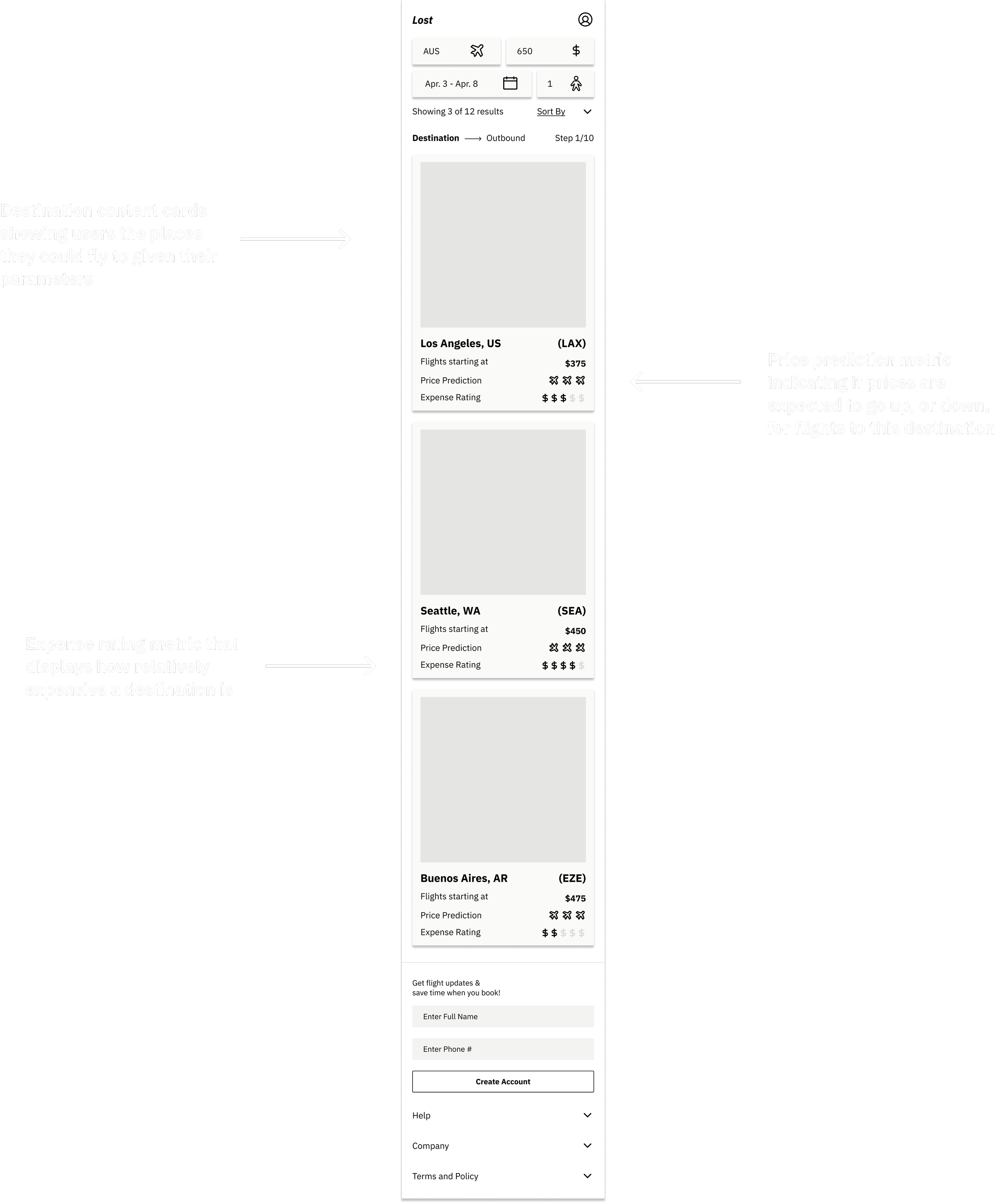
For the initial wireframes, I reviewed my findings from competitive analysis and tried to incorporate the essential information for booking a plane ticket while shedding any intrusive or irrelevant elements. Lost needed to feel straightforward, simple, uncluttered, and trustworthy even at this fidelity.
I tried to accomplish this by focusing on the following themes:
Search & discovery capable
Clear path to checkout
No hidden steps
Intuitive layout for results page
Helpful review pages
Visual hierarchy
Users had also mentioned during interviews that they preferred the following features:
Guest checkout
Multiple payment options
Flight watching
Price prediction
Wireframes
Usability Testing
I put together a lo-fi prototype using Figma and began a round of usability testing. I was testing the main user flow of:
searching for a place to go
booking/paying for flights.
My main concern was making sure users were understanding the concept of Lost. Most airline comparison/booking businesses have users search for flights between two destinations, where Lost used a different set of parameters to discover flights to new, unspecified places.
For the most part, all users understood the concept of Lost and felt like it was a very simple and straightforward process of booking a flight. The changes I focused on were to help users more clearly know:
where they were in the process of searching/booking
what the purpose/intent of each page was
that all the information they needed was available
These conceptual changes involved making adjustments to font sizing, breadcrumb design, title sections, semantics and more.
Affinity Map
UI Kit and Style Guide
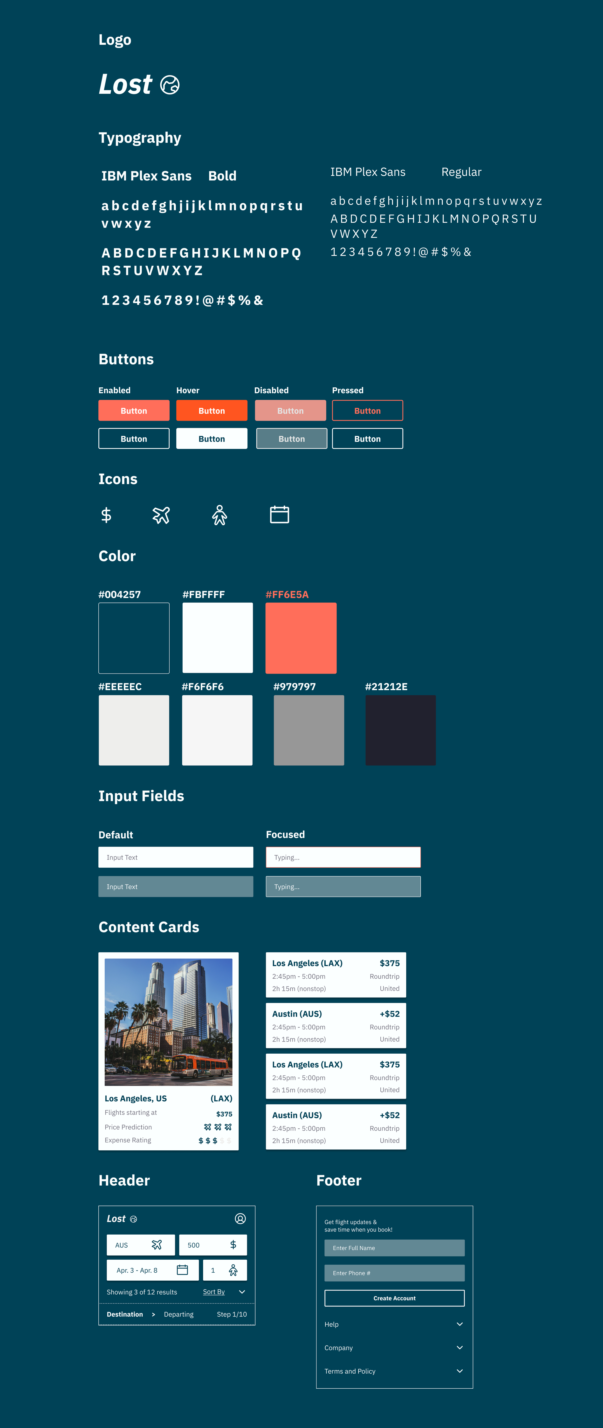
The inspiration for the logo and branding came from successful competitors like Hopper, AirBnb, and Vans, which are products Terra associates with.
The globe helps represent world travel, adventure, and exploration when paired with the product name.
The deep blue/green color was chosen to create a calming experience throughout the booking process without overstimulating or straining the user.
Header designed for users to have access to key information in one location: parameters, sort option, breadcrumbs, account access.
Clear CTA color that visually pops to grab user attention and aid in visual hierarchy.
The name, Lost, was a branding idea I came up with to go along with the “world traveler” aspirations of our user persona and one of her favorite quotes, “not all those who wander are lost.”
Text-message notification system incorporated into the footer to be visually available for users, but not intrusive to the booking process.
Inspired by brands like Hopper and AirBnb, I chose a simple and readable sans-serif font.
USability Testing
The first round of usability testing was extremely insightful and really helped me refine the visual hierarchy throughout the booking process of Lost. I conducted a second round of usability testing, and created an affinity map of the user feedback afterwards.
Key changes:
Increase the size of the “additional baggage/seat selection” disclaimer and adding it to the final review page
Rearranging the “Price Prediction” and “Expense Rating” metrics so that they were higher in the visual hierarchy and not overlooked during flight selection (these metrics were highly favored in user interviews)
Adding an “edit” icon to the final review page so users are aware that they can change some details if needed
Affinity Map
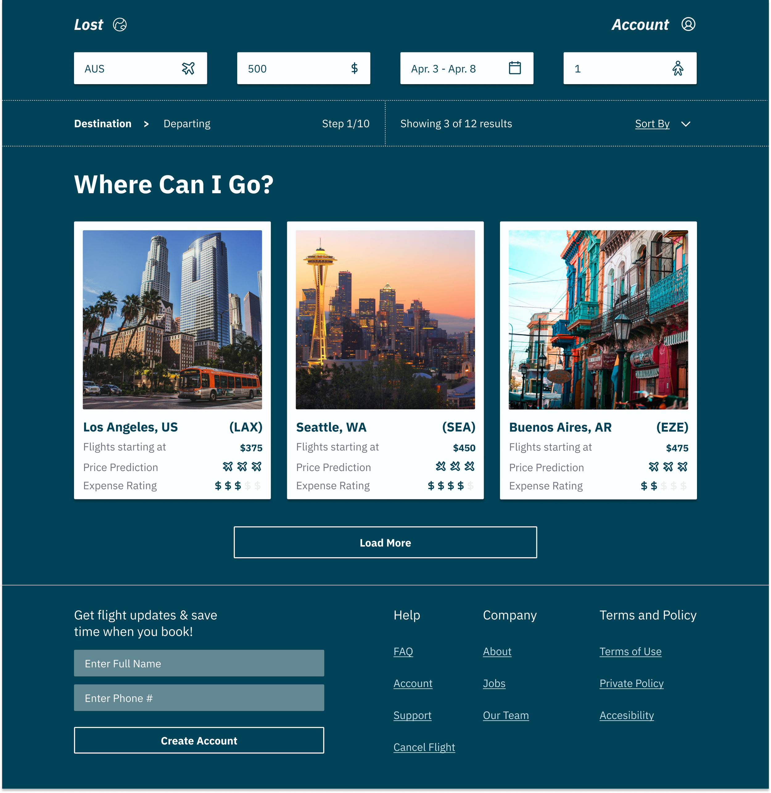
High Fidelity mockups
Given the time constraints on the project, I wasn’t able to do further rounds of usability testing or research. I implemented the changes from the second round of testing, and finalized my UI mockups. I designed Lost originally with mobile in mind, but adapted some screens for desktop since users could be using other devices.
During user interviews it became apparent that many young individuals, despite having access to products like Hopper, were still feeling a lot of apprehension and anxiety around booking travel. Users mentioned that their most memorable travel experiences came when they made spontaneous travel decisions inspired by a fleeting emotion, rough week at work, phone-call from a friend, or inspirational instagram post from a travel blog. They needed to get Lost, and be able to do it faster.
Final Solution
“I just need to get away somewhere…
The final solution is my attempt at addressing the frustrations and pain points users like Terra experience using traditional booking platforms, while simultaneously empowering and inspiring users to go beyond their comfort zones and find new adventures. Lost is a travel booking product that allows users to discover new destinations based on budget and timeframe, and easily book airfare without any unnecessary hassle.
…Where can I go to get lost?”
Prototype
📱
Prototype 📱
Prototype
-
Prototype -
Challenges
Since this was a conceptual-based project, it was difficult at first to establish a clear vision for the product, however, user research and competitive analysis really helped clarify our product goals.
As I started designing wireframes, I realized how intricate booking can be, and I had to learn a lot about how travel booking operates on-the-fly and adapt my process accordingly.
Lastly, being the sole contributor on this project, it was challenging at times to make design decisions, which may have been easier if I was part of a larger design team. I had a manager to recieve feedback from and because his participation was really hands-off it forced me to push my design abilities further and be confident in my choices.
NExt Steps
Ideally, at this stage I would be ready to hand-off my deliverables and documentation to developers.
This process would include providing my team with synthesis of user research, the UI Kit, persona, mock-ups, and the final Figma prototype.
Going forward, I would ideally get a MVP built and begin more user testing along with web analytics to gain insight into bounce rates, retention, and other KPIs.


