Now & Forever
Transitioned Retail CLothing Brand into Ecommerce
Role
UX Researcher
Product Designer
Timeline
January / February 2022
Skills
User Research
Information Architecture
UI Design
Prototyping
Tools
Figma
Whimsical
Optimal Sort
Now & Forever (N/F) was a brick-and-mortar retail clothing brand that needed to expand online.
Ecommerce sales have increased from 4.2% to 15% of the total U.S. retail market.
Customers constantly asked employees if they could return goods online, order a size that wasn’t available, or buy something at a later time.
I had to conduct preliminary user research and outline how to adapt their business to the digital landscape.
user Research & exploration
Who were the top performing competitors in the ecommerce clothing space?
Jakob’s Law
Users spend most of their time on other sites, and prefer your site to work the same way as all the other sites they already know
What can we learn from Them?
Embrace Competition
In the world of trendy fast fashion, competition is not a hurdle but a catalyst for success. Consumers thrive on choices and actively seek alternatives, making the competitive environment an advantageous landscape. N/F aims to tap into this consumer behavior, positioning itself as a desirable alternative for those who love to explore options.
Jakob’s UX Law
Acknowledging Jakob’s Law, N/F should then mirror the design elements, information architecture, general form, and navigation functionality as other ecommerce sites while differentiating through their brand identity. In effect, users will then be able to use N/F webstore seamlessly without learning new skills and reducing user frustrations. HM, Shein, Zara, Gap, and Amazon are the baseline for our design inspiration going forward.
Brand Identity
For N/F, the key to standing out lies in crafting a distinct online brand identity that merges their traditional brand with online best-practices. This identity should seamlessly intertwine the brand's essence—trendy, affordable, and modern aesthetic. By mirroring design principles from successful competitors' websites, N/F aims to tap into existing user pools while adding its unique touch.
UX Strategies for Success
User-Centric Website Design
Mobile Optimization
Visual Appeal
Efficient Checkout Process
Dynamic Content Updates
Social Media Integration
Feedback Mechanism
Community Building Features
Characteristic Design PAtterns
Following Jakob’s Law, I analyzed and identified high-impact elements that user’s expect to be present and function how they’re used to. Here a few examples.
Product Pages
1. Favorite Icon <3
2. Load More CTA (not pages)
3. User Reviews + Images
5. Size Guide
Header elements
1. Super Nav
2. Search Bar
3. Promotional Banners (avoid)
Provisional Personas
A few provisional personas emerged through competitor analysis and ecommerce research. These personas serve as a useful way to help identify who N/F’s target online audience could be and who we could be designing for.
The Fashionable Friend
Always up-to-date on the latest trends, gets frustrated when a site has limited search/filter options.
The Overexcited Shopper
Sees an article on display or in an ad and immediately tries to buy it, but irritated when their size isn’t available.
The Pragmatic Shopper
Loves trends but doesn’t believe in overspending, likes to shop alternatives. Doesn’t like waiting in lines or using clumsy online checkouts.
User Interviews
Screening Questions:
Do you shop online? (Yes)
Have you purchased an item(s) online in the past two weeks? (Yes)
Interviews, “tell me about a time when…”
Most recently purchased an item online
Most recently went shopping at their favorite clothing store
Interview Insights
Users actively build carts/wishlists
Recommendation systems from preferred brands
Mix of item-specific and casual browsing
Quick, hassle-free browsing and favoriting features
Customer reviews are crucial on unfamiliar websites
Real customer photos significantly influence purchase
Confidence in online buying boosted by size and measurement details
Return process aversion
Hesitancy to order if unsure about fit
Utilization of search, sort, filters, and categories
Growing discomfort with physical shopping - anxiety, overwhelmed
Short attention spans for identifying appealing clothing
Avoid overstimulating - SHEIN, Fashion Nova
Motivated for new clothing by boredom, seasons, social media, stress
Defining our user
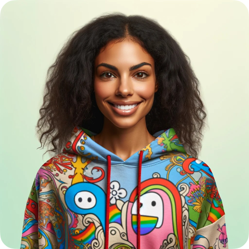
Natalie The Retail Therapy Shopper
Natalie, a vibrant 28-year-old urban professional in Chicago, finds joy in exploring the city's endless activities. Holding a marketing job, she's a trendsetter among her peers, always seeking trendy fashion to match her dynamic lifestyle.
Goals & Motivations
Natalie desires an online shopping experience that effortlessly aligns with her fast-paced life. She aims to stay fashion-forward, discovering unique pieces for various social events that define her social life. Convenience is key for her.
Challenges & Pain Points
Natalie despises outdated sites, and tedious return proccesses, yearning for an enjoyable and stress-free online shopping experience. She values quick access to desired items, prioritizing user reviews and accurate product descriptions for confident purchasing decisions.
Goals
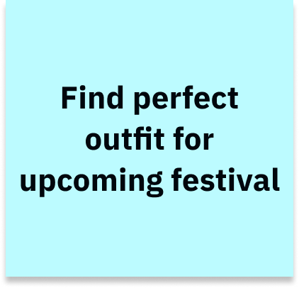
“I can’t wait for Lolla! Last year, I planned us the perfect festival day and my outfit was bomb!”
Frustrations
N/F needs to focus on creating a user-centered web experience, borrowing design patterns from minimalist digital brands like HM & Zara, and avoiding overstimulating design elements (SHEIN & Fashion Nova).
Return process aversion is a major decision metric for online shoppers. having transparent sizing guides, reviews, return process, and an uncluttered shopping experience leads to more confidence shopping online.
Information Architecture
Ecommerce companies face a unique challenge when it comes to information architecture. For a clothing brand, there can be a vast amount of distinct web pages that must co-exists, and how a brand chooses to organize their products, information, and pages hierarchically can drastically affect the user experience. Conducting a card sort to understand how users’s naturally organize items, categories, and information is a great way to ensure a website flows naturally with how customers think.
Dendrogram
Open Card Sort
Organize the following 61 items (jeans, tube tops, sunglasses, etc…) into groups and assign a label to each group/category.
Using OptimalSort to analyze the data I created a dendrogram and similarity matrix to understand patterns between how each user organized the items. This information combined with market research of competitor’s informational hierarchy, helped me craft the navigation system for N/F and how/where products exist within the website.
Similarity Matrix
Designing A Solution
In keeping with a minimal design motif, N/F’s website needed to have a clear, easily understandable navigation system to help user’s find what products they’re looking for. Using the card sort exercise along with market research, I created a sitemap to organize every distinct page that needed to exist within N/F’s framework.
I focused on keeping the high-level categories as minimal as possible, and each sub-level category as universal as possible between men’s and women’s.
Site Map
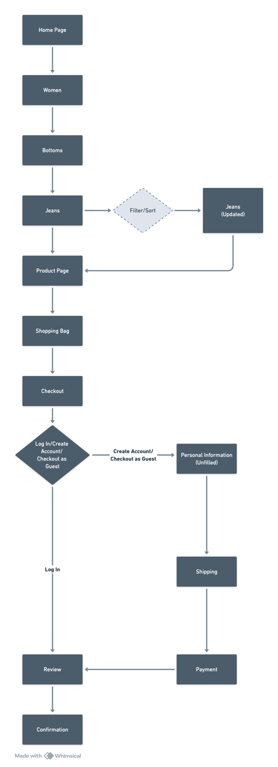
Task Flow
User Flow
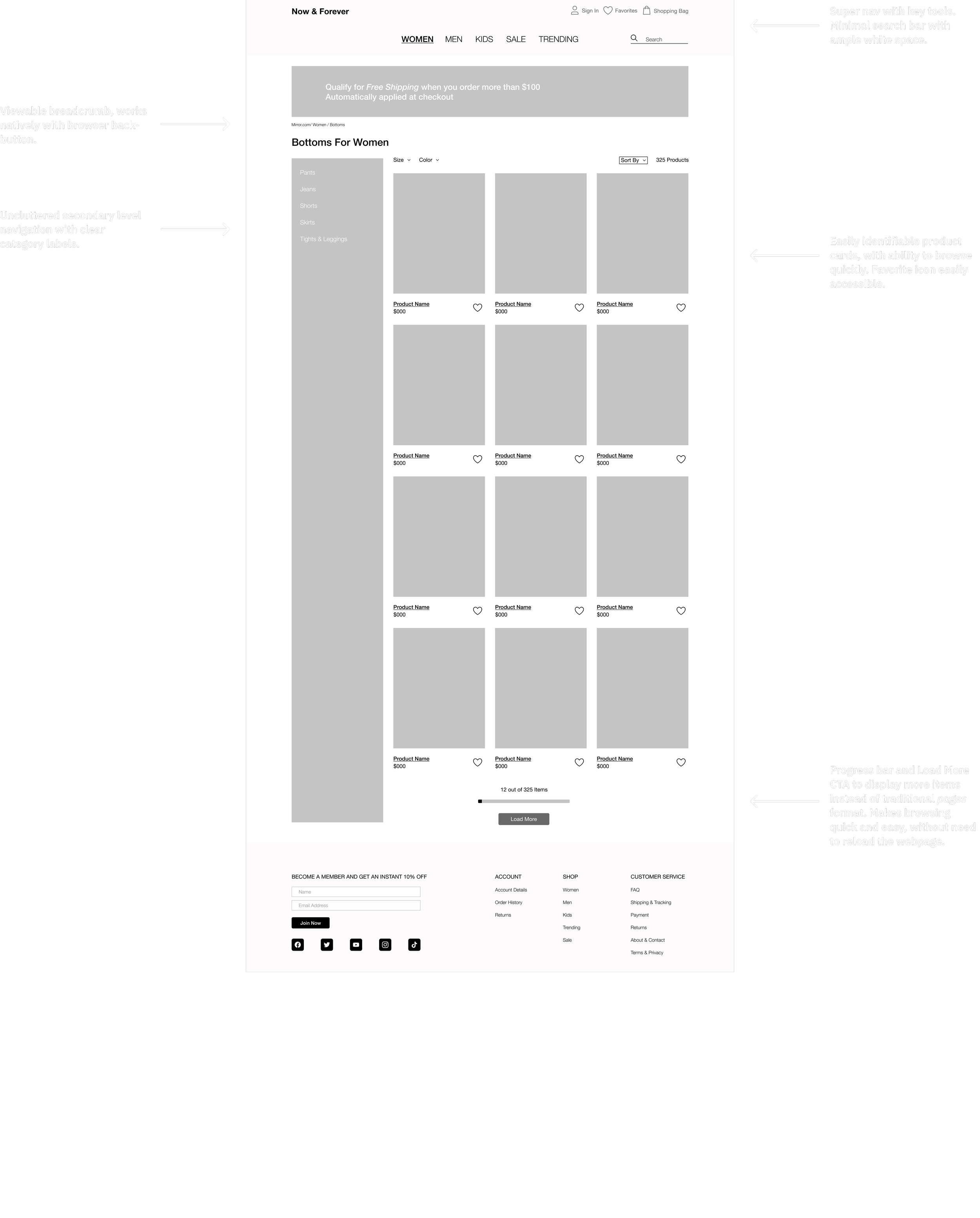
Wireframes
Key Design Insights
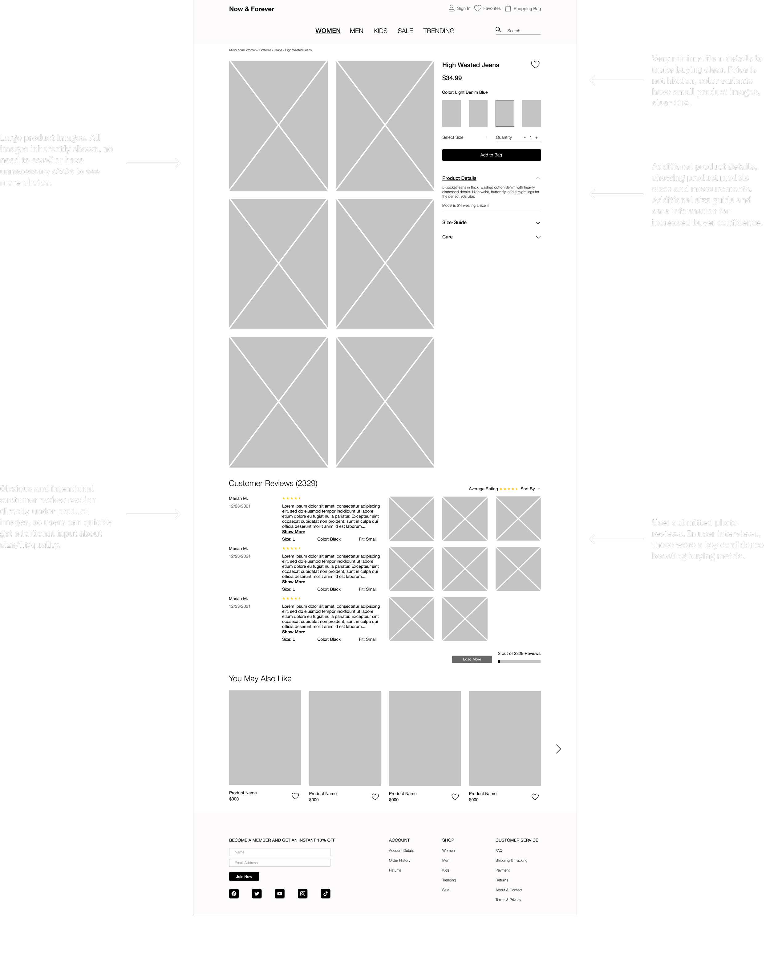
User-submitted reviews with descriptions and images
Detailed product pages with model sizes and measurements shown
Ability to favorite / create a wish-list
Minimalistic design aesthetic with ample use of whitespace
Uncluttered navigation bar and elements
Ability to search or browse for products
Minimal pop-ups/ distracting features
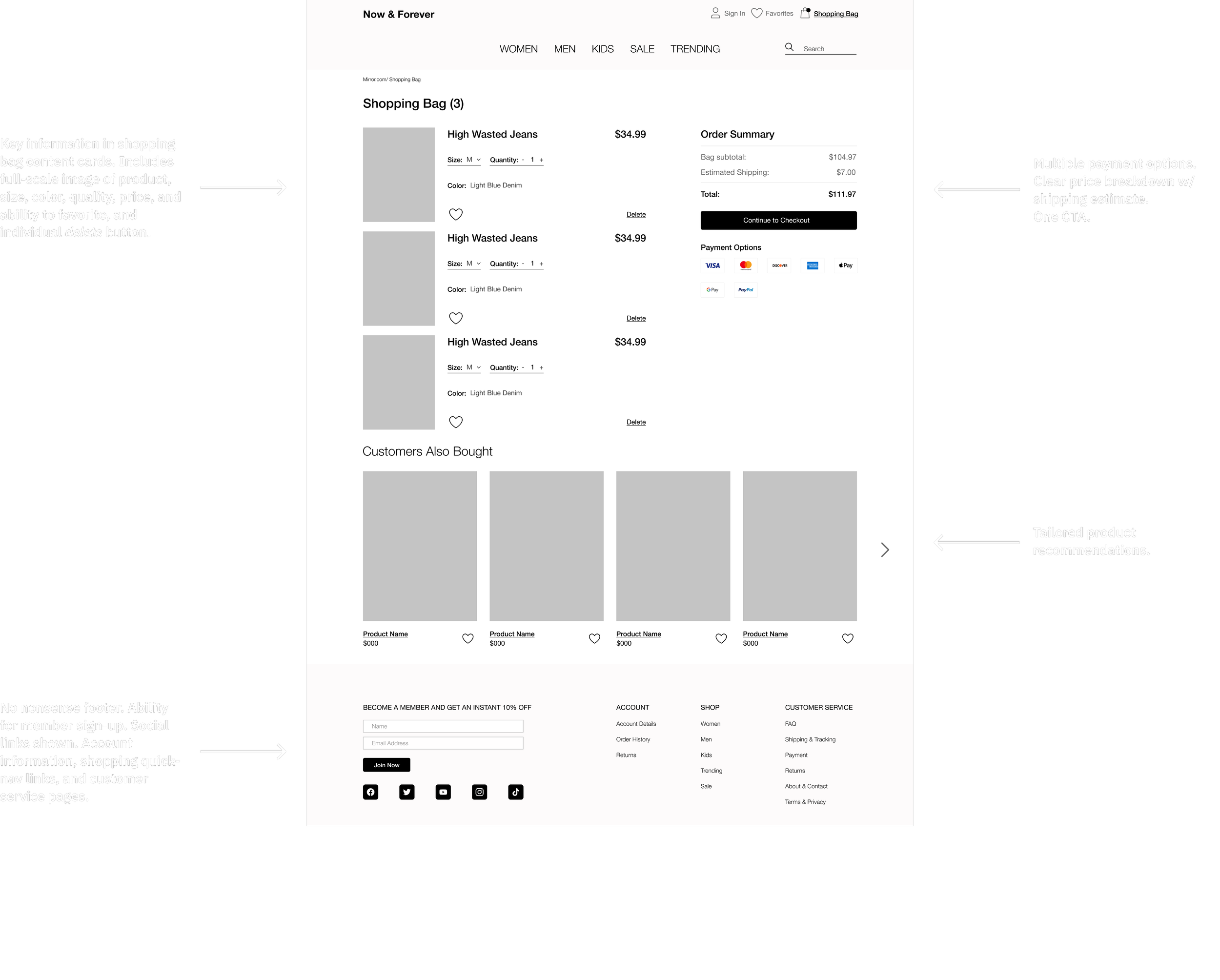
Multiple payment options
Clear breadcrumb trail
Product recommendation system
Clear shopping bag with uncluttered elements
Easily identifiable and glanceable content cards
Social feature
Lo-Fi Prototype
brand identity & UI Design
Similar to the research stage, I looked at competitor’s brands for inspiration and what to avoid. Further, I conducted research using Natalie as a frame of reference:
What brands was she wearing?
What activities would she be doing?
How does her choice in clothes act as an expression of herself?
What social media does she use?
By referencing back to our user persona, a digital brand identity can stay true to its target audience and not create dissonance with potential customers. N/F needed to align itself with it’s audience: young, trendy, fashion-forward, professional individuals. Without becoming boring, or childish. Inspired by brands like Vans, that have a timeless yet modern aesthetic, and modern minimalist web-stores like HM and Zara.
UI Color Palette
The color palette was inspired by N/F’s vision boards and the design motif of minimalism and efficient use of white-space. By using modern colors that are slightly toned down, N/F’s digital identity can adapt well to screens, won’t strain user’s eyes, and creates a fashionable and uncluttered look and feel - much like a well designed art gallery or exhibit.
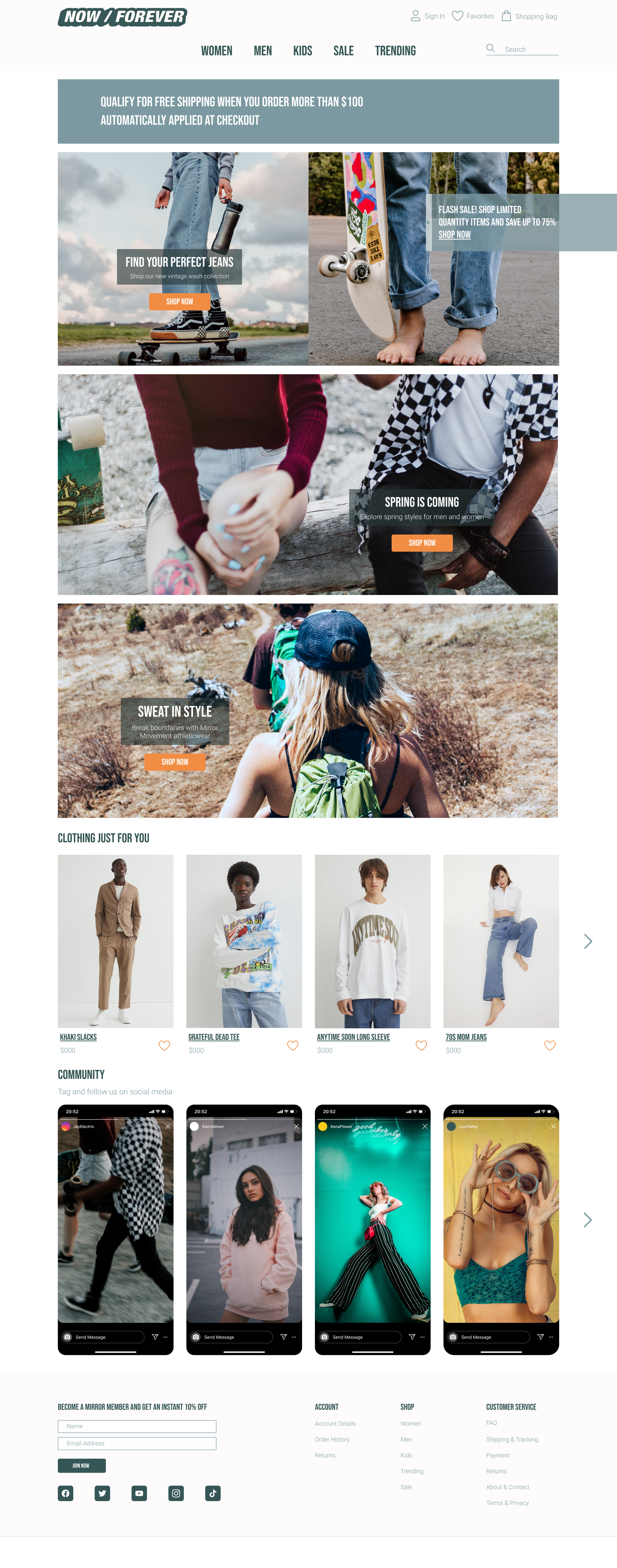
The splash of muted orange, provides ample color for CTAs, highlights, notifications, while standing out against off-white and blacks better than yellow. N/F needed a cool and calm aesthetic that invoked pleasant feelings, social inclusivity, while having splashes of color to inspire excitement and youth. Blues and off-whites served as the secondary colors and neutrals.
Logo Redesign
The redesign is a Y2K inspired logo, referencing the days of youth that many of N/F’s customers grew up in. Furthermore, the name, Now & Forever, hints at the idea that style and attitude are timeless, and clothes are way of expressing that. Much like the idea that the-year-2000 was going to change everything, but it didn’t, N/F is here to cement itself as a brand that isn’t going away, regardless of what is to come.
Moodboard & Inspiration Images
Brainstorming Ideas
User Interface Kit
Hi-Fidelity Mock Ups
Usability testing
The hi-fidelity mockups were used to create a Figma prototype that could be used for usability testing. Users were asked to complete the task flow:
Shop for & purchase a pair of women’s jeans
Main concerns at this point were to see if users could:
Quickly find where women’s jeans existed
Intuitively add a product to the shopping bag
Navigate on their own to their shopping bag
Review purchase and find the checkout CTA
The goal was that N/F’s web store experience was compatible with users’ pre-existing mental models of how ecommerce stores work. From there, the branding and design would be to minimize incoherence and elevate the shopping experience compared to competitors.
Areas of Confusion
Solutions Ideas
Final Solution
Now & Forever was a brick-and-mortar retail clothing store that needed to expand to ecommerce.
With cool tones, ample white space, user reviews, high-quality imagery, and the avoidance of common overstimulating ecommerce errors - N/F’s web store inspires shoppers to find new trends, build wishlists, connect within the community, and buy with confidence.
By leveraging their modern, fashion-forward clothing aesthetic, and revamping their branding - we were able to situate N/F’s into the forefront of the ecommerce market.
Please take the chance to play with our Figma prototype below that follows the task flow of a user: shopping for & purchasing a pair of women’s jeans.
Prototype
•
Prototype •
Challenges & Next Steps
Working on this project emphasized the critical roles of:
Empathy Research
Usability Testing
The user persona and empathy map became constant guides, ensuring the target user's needs remained at the forefront of decision-making. Without a solid understanding of who the target user is, it can be difficult to make informed design decisions later on.
Next steps include:
Prioritize revisions based on usability testing feedback
Continue iterative usability testing for ongoing improvements
Hand off refined Figma designs and prototypes to developers
Validate the design through web analytics and gather market feedback


